This evaluation is to explain the processes used to film and edit our music video.
when shooting our footage, we decided not to use the college's Canon XM2's. Instead we used our own camera which was actually as digital single lens reflex camera. This enabled us to shoot a high digital resolution of 720p. It also allowed us to make use of additional lenses for more camera angle opportunities and sharper image quality. We primarily stuck to a 50mm f/1.8 lens. this allowed us to get a perspective equivalent of what the human eye sees. Also the large aperture of 1.8 allowed us to create shots that used pull focusing without having to a telephoto or zoom lens. The large aperture also allowed us to film in low light situations where other lenses would not cope.
The setting on the DSLR are easier to manipulate than on the canon XM2. this is because you have separate and independent controls to operate essential controls such as white balance, exposure compensation, aperture etc. With the XM2 its a lot harder to access these controls on demand, loosing location time. Also using digital format it is a lot easier to check back footage on location to check lighting and composition. Digital footage is also a lot easier to use in post production, in our case the industry standard, Final Cut Pro.
All of our shots we done with our camera mounted on a tripod, this is essential for good quality smooth shots and also for checking and setting up compositions. We also found the tripod valuable when it came to pull focusing to enable smooth transition of depth of field. To check that the camera was level , we clipped a spirit level to the hot shoe of the camera and lined it up to ensure all of our shots have consistent level angles.
We decided that we were going to keep the camera's position still in all the shots. Therefore we used no panning or tracking shots. We thought this would keep a consistent flow the the video and not get in the way of the actually story the video was telling. However we did use pull focusing on several occasions by smoothly and slowly twisting the focusing ring on our lens using a large aperture. All our shots were filmed in manual focus, this is to avoid sudden changes in focus if the camera were to pick a fly or a small speck of dust in front or behind the intended point of focus and depth of field.
When filming on location, especially the indoor footage, we used a piece of white paper to set our White balance correctly instead of the camera trying to work out its own white balance, judging the colour of the light in the room. we manually adjusted the white balance on the camera using the setting to adjust the colour balance in the kelvin temperature spectrum to get the correct white balance.
In general we let the camera decide the shutter speed based on what aperture we were using. If we needed to compensate less or more light we adjusted the exposure compensation value as it is easier to get consistent results using a Digital SLR.
early on in the blog I talk about the use of a Shooting Scrip, Skeleton and storyboard and how it helped us to film each shot in order and to save time thinking up shots or plots on the spot. In combination with this we used a piece of paper with the shot number and take number written on it as a clapperboard. in conjunction with the storyboard this made it much clearer which good shots we were going to use when beginning our post production in final cut pro. further more each shot saved as a different digital file, saving us the time of capturing back to a digital format and sifting through a load of film to find our shots. Sometimes we thought of improved shots and new ideas on location and ended up using these ideas in the final video, but on the whole the storyboard kept us on track and moving in a positive direction.
as we had a very small cast selection (2 people) and smaller crew (2 people) I was doubling as one of the actors and crew, setting up camera angles, checking exposures and apertures and white balances. This made the total of our entire cast/crew 3 people. Due to this it was fairly easy to organise times to film on location, therefore eradicating the need to a production schedule.
All of my ideas were my own and though i have seen a few things briefly on music video channels I was inspired mainly from the music.
There were a few problems when in the post production stages. because we shot in a high resolution of 720p, we found the time to render our footage in final cut pro was taking an extremely long time. There were two solutions to this. One was to re shoot in a smaller resolution which would have taken too much time for our tight deadline. The second option was to cut the footage down into smaller sizes which we could then pre position before rendering. This is the option that we took. Our camera recorded sound that we did not want as we just wanted to put footage with no audio. It was easier to unlink the audio that went with the visual footage but pressing command + L.
Wednesday, 31 March 2010
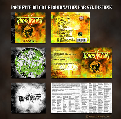
Final Digipack Design

Here is the final digipack product that with include the single and the bonus music video disc. As you can see this design is to be folded where the pink line runs across the centre this will create the layout that will feature the front cover, rear cover, inside cover and the disc tray cover in the right order. To design the template I used Adobe InDesign. this created a frame to scale that is industry standard with pinpoint accuracy. The I 'fabricated' the template in photoshop building up the design starting wit the image as the cover backgrounds and then the additional information and design work on top. Layers helped me to keep everything organised and accessible for later tweaking and positioning. here is an example of the setup i was using to create the design, you can see they layers palate on the right hand side where i used to organise everything.

I based my template on a design from Copy Sound which included the industry standard measurements. these measurements allowed for a disc tray to be included as well as enough space left for bleeding and for the spine of the digipack. The digipack itself will be constructed out of a durable, environmentally friendly cardboard.
Here is the design i based my Adobe InDesign on:

Friday, 26 March 2010
Update to Digipack design
after creating my final advertisment for Who's the Enemy i decided to change my Digipack design to fit the same theme and idea as the ad, This is so that people associate the single with the advertisment and make that visual link between the two. Therefore the audience are going to recognise the single and be more sure that it is the right item they are buying. I think people feel more reassured and comfortable when thet can make a visual connection to something.
Here is the rear cover of the single: (click image to see correctly)
 As you can see it still needs work in design and other elememts such a copyright notices, price and barcodes ect. I will also probably update the style once again to make it fit in more with the rest of the digipack design.
Here is the single front cover (right hand square) and the inside cover (left) (click image to see correctly)
 I created this buy using a template i created in Adobe Indesign which allowed me to created a layout that is to scale. I then imported the template into photoshop which allowed me to start on the design elements. As i said above i wanted to go on the same theme as the Advertisment so people could relate the digipack to the advert and intstantly recognise the two and make a connection. For the front cover of the digipack i firstly dragged in the image, scaled it down to size and then cropped the lower half off so i still had a clear space to put the band logo and name of the album. I used different layers in photoshop to make it easy to move the text around and to resize and reposition the images and text. On the front cover I cut the boy out and made him a seperate layer. this allowed me to keep him in colour, while turning the background into black and white. This is what i did for the Advertisment and it creates a sense of sperateion, isolation and dissconection from the girl in the background. For the digipack ocver however I wanted to make a slight variation from the Advert so I took away the blue channel in the RGB channels layer to produce a yellow cast that will stand out against other albums and digipacks in store. I also included a black boarder around the front cover of the digipack to create a neat finish. I also think the inclusion of black against the yellow really makes a bold combination that is an essential element to help make products stand out. I produced the black boarder by going into the blending mode of the layer I was working on (the front cover image) and dropping down to the 'stroke' tab (which means boarders in Photoshop). I then selected the boarder to be on the inside of the edge. If the boarder was set to outside the edge we wouldnt see it because it wouldn't be in the set frame size. I then selected the boarder to be black and a depth of around 7 pixels to create the thick, bold finish. I will also include 'Includes bonus music video' on the front cover because the advertisment clearly stats that there is going to be a music video included in the digipack. for the inside page i did not include a boarder as it needs to fill the whole of the inside sleeve with colour. The type face I used for the inside cover was a preset one called 'impact'. I positioned the larger yellow text at the bottom so our eyes scroll down the image first, so we don't miss the detail. the text is also yellow that stands out and grabs our attention from the contrasting dark area behind it. the text of the tracks on the single are placed mirrored to the single title just to add an element of composition and contrast within the square frame.
I will probably end up creating a different abd updated frame set which includes the front cover, inside cover, double CD tray (which fits both the single and the bonus muisc video), and exterior rear cover so I can see the whole design in context.
Here is the rear cover of the single: (click image to see correctly)

Here is the single front cover (right hand square) and the inside cover (left) (click image to see correctly)

I will probably end up creating a different abd updated frame set which includes the front cover, inside cover, double CD tray (which fits both the single and the bonus muisc video), and exterior rear cover so I can see the whole design in context.
Friday, 12 March 2010
Final Idea for a Promotional Advertisment

This is my final idea for Advertisment. for a bold effect I have used only one font that was sourced on the internet called '28 Days Later' as it resembles the text from the film. For the title of the advert and the band logo I used more subtle colour cominations, for example black and crimson on gray. I thought that this did not to need to be bold because its large in size and its on the top banner so everyone is going to see that first anyway. I also thought that it might over power the advert and then loose all its meaning. However for the important information along the bottom of the advert I use contrasting combinations such as white and red on black and black on white. I made this text smaller though, so it stands out but doesn't take too much away from the image which is equally important. I used the black on white for the limited edition text just to break up the information on the advert, so its easier for the brain to work out quickly at a quick glance.
I cut out the boy sitting on the bed and made a new layer of the cutout, so it looked seamless. I did this because i wanted to turn the background black and white and keep the boy in colour to put across a message that the single is about feeling excluded and isolated and the story of two people and incompatability (notice the girl in the bed). The main subject also stands out if it is in colour and the rest is black and white
Inital Idea for a Promotional Advert
In discovering that less is more analysing exisiting Promotional Advertisments I produced a rough initial idea outlining the image and text i want to include in my final advert.


I like the use of diagonal lines in the composition of my chosen image that was photographed by me on a tripod on location of one of our shoots for the music video. the wide angle lens used give some distortion the the perspective of the image giving an uneasy story within the imge. The strong line on the right hand edge of the bed leads the eye deeper into the image, drawing your eyes to the girl in the background lying in the bed. the line where the wall meets the ceiling also creates intrest to the composition. This line is diagonal which helps the break up all the other straight lines in the image. the cannted effect that this line creates adds to the uneasy nature of this image and might further influence the taget audeince to look further into the story by buying the digipack.
The font I used fits in with the alternative indie style of the track and the music video. I though of creating a modern, chopped up and slighty rustic look using the solid blocks of balck with the different coloured type faces placed on top of them. I used the 'little is more' concept that i saw in other album adverts. to get the relevent information across simply and without any confusion.
Analysis of Promotional Adverts
In order to promote and market my digipack well I need to produce an advert that is both simple and to the point and effective at grabbing the target audeince's attention. It also has to make the target audience want and buy a hard copy of the album rather than just downloading it off of the interent.

here is an advert for the most recent David Bowie Album, 'best of bowie'. as you can see most of the advert speace is just taken up with a collage of bowie made up of smaller thumbnails of past portraits of him. This immediately grabs your attention with the amount of detail which draws you in. I ended up thinking that if the artwork on this advert is that well thought out and creative that the album artwork must be worth having in my collection and the order of the tracks on the CD must we well thought out as well, which would further temp me to buy a hard copy of the album rather than just downloading a few of the tracks off of the internet.
Information in terms of writing is very simple and to the point on this advert. The title of the album and information that it is 'out now' is all that is given. I think this a good example of of little is more. The fact that there is a DVD as well is also a good idea to include if Bowie fans decide to download the album off of the internet there is still a dvd which would be even more tempting as it would fulfill our visual needs which in my opinion are just as, if not more important that out audiable needs.
Friday, 12 February 2010
Example of distracting objects in shot
This is from out first location shoot in brighton. as you can see there is a bin in the background that spoils the shot, after evaluating our footasge back at college we went back to brignton to do a re shoot, whith some extra ideas that we could also shoot.
Friday, 5 February 2010
Camera work - Pull focusing
Here are two examples to show pull focusing with our different equipment. This is a good way to creatively move from one shot to another or to lead the audiences eye into the intended composition. I found the best way to achieve a very shallow DOF on the Canon XM2 was top zoom all the way in and stand as far back as possible from the subject matter. On the Canon 500D we found this was not an issue as we were using a 50mm F/1.8 lens with a natrually very shallow DOF.
The first example is using the Canon XM2 Zoom all the way in without a tripod.
The first example is using the Canon XM2 Zoom all the way in without a tripod.
This next example is using the Canon 500D with a 50mm f/1.8 lens
Cameras avaliable to us for filming
For the production of the music video we will be using two different cameras, one film (Canon XM2) and one digital (Canon 500D) with a range of different lenses. For ease of use and quality we will probably use the canon 500D as it is easier to cut, and then capture back into final cut pro.We wont need to focus on sound quality as we are just using the video captured over our track
Friday, 11 December 2009
Music Video Presentation to Feeder's Record Label
Here is the presentation we pitched to Feeder's record label about the proposal of the new music video for 'Who's the enemy'. When you follow the link it will take you to a PDF of the presentation hosted by Google Docs.
Digipak: Research and Analysis

I chose to Analyse this set of image because it is a good example of going over the top in your designs. This design looks like it could be for a dance, Drum and Bass or Jungle music target audience. The attention to detail is considerably less that the hazey janes suggestion that these target audiences are not interested in the story behind the music but just the music its self. My point that I make about the hazey janes CD design being simplistic yet effective still plays its roll as when I look at the CD design from this album I think nothing much of it and think there is too much going on and you wont see it much anyway. On the other side of the argument it obviously appeals to the target audience of the album and so therefore its justifiable

The Hazey Janes' album covers are a good example of what I would be interested in creating. Instead of using real photos or portraits, They have used draw Illustrations instead. I think this opens up the creative possibilities and therefore can make the album cover works of art and deliver maximum visual interest. I also like the way in which Each of their covers have a consistent theme in the terms of colour, fonts and visual ideas. I notice straight away the simple idea of having the disc in one colour. Many other disc designs can be way over the top and although this might be nice to look at, you're not going to see the CD much if you use it. I also like the crumpled, cardboard look of the bottom design, which is subtle yet completes the look and the people looking at this digipak design might not notice this at first but i plays a big subconscious part of the overall design.
Friday, 4 December 2009
Digipak flat plan designs 1
 digipak 1 - outside here you can see that i have gone along with the theme of claustrophobia and loneliness. this design is realistic because we would be able to get the shots we need when filming on location. I want the colours of this plan to be warm and have a slight offset to make it kind of humble looking. as you can see on the outer front pannel there is the london eye on the right. this suggests that this location is the milenium bridge, although it could also be westminster bridge, as we could get the london eye in the left hand side of the frame with a wide angle lens.
 digipak design 1 - inside. On the inside of the digipak design there is a simple background on the left which would be suitable to include text over the top of. the disc desgin are simply coulds. being realistic i am not going to be able to produce a piece of art onto a disc with the limited amount of resources that are avaliable to me.
Digipak flat plan designs 2
 digipak design 2 - outside here is a simple outer design but in this case it says a lot about what 'who's the enemy' is about. If you can make it out, it is an epic looking sun rise or sun set with a lonesome tree on a large hill, similar to one of the locations i live near. ithought that on the outer rear panel of the digipak, it would be a good idea to crop in on that tree so it makes up for the lack of detail on the outer front panel
 digipak design 2 - inside. On the inside for the disc i would like the colour to be a dark, royal blue because from experience in buying Cd's I know this works. Also I would like for the title to be on the right hand side in its own box, orange in colour with back font. as for the panel on the left there is a continuation of the theme with a person standing on a large hill, looking into the sky with a guitar and a small amp, to give the connection to music. Simple, yet effective
 digipak design 3 - outside. This is my thrid and final flat plan design and probably the most ambicious too. On the out front panel i had the good idea of getting some people together, including the main character from the music video to pose as a band playing the feeder song 'who's the enemy'. The idea is that i use the studio booth window to frame the band inside, while having the mixing console in the foreground. This fills the whole cover and adds more visual interest that the other flat plans, drawing the target audience in to have a close look. The rear outer panel design will simply be of two speakers on stands and a mic set up in the middle of the shot to repesent maybe a live performance setup on a black background.
  digipak design 3 - inside The inside of the digipak will run on the theme of studio and performance like the rear panel on the outer cover above. This tine instead of just the mic and the two speakers, we see a shillouette of the singer, being the main character from the music video cuased by there being a spot light to add a different perspective. The different lighting will add strong visual appeal.
Friday, 27 November 2009
Promo Pack
A"Promo Pack" is used for booking shows, searching for record deals and publishing deals, recruiting a management and legal team, and for gaining radio and television airtime.
A digipack usually contains the following items:
Digipaks typically consist of a gate fold paperboard or card outer binding, with one or more plastic trays on the inside to hold a CD or DVD. Since Digipaks were among the first alternatives to plastic CD cases to be used by record companies, and because there is no other common name for the term, digipak is often used generically. This is a more environmentally friendly way of producing album arts and packaging which proves that the music industry is helping out and responding to climate change and recycling issues which are pressuring businesses and corporations to respond and make changes to the way in which they work
I will be creating my Single cover as a part of my Promo pack in this format to show that we are also diverse and on board, helping with environmental issues.
A digipack usually contains the following items:
- A demo tape/CD of 3 to 5 of the bands best songs
- A song list
- A lyric sheet
- copyright and contact information
- Digipak designs
Digipaks typically consist of a gate fold paperboard or card outer binding, with one or more plastic trays on the inside to hold a CD or DVD. Since Digipaks were among the first alternatives to plastic CD cases to be used by record companies, and because there is no other common name for the term, digipak is often used generically. This is a more environmentally friendly way of producing album arts and packaging which proves that the music industry is helping out and responding to climate change and recycling issues which are pressuring businesses and corporations to respond and make changes to the way in which they work
I will be creating my Single cover as a part of my Promo pack in this format to show that we are also diverse and on board, helping with environmental issues.
Friday, 2 October 2009
Mise en scene
- Location
For the location we have chosen an available attached 4 story house that is modern on the inside, it is also close to the town centre for good access for cast and crew. This location is also suitable to out need because there is a lot of spare space to work with and that will not be an issue. One of the rooms in the house is what we imaged when planning out initial ideas, there is a double bed next to a window with blinds , so we can create the effect we are after with the moon light coming in through the window. We could use the en suite bathroom to an advantage as a prop or an entry/exit point in some shots.
The second location in the house we would use is the kitchen. this is a long, modern kitchen with, again, plenty of space and good lighting to film in. This would also fit the bill as it is in the same house as the other filming location and it would be easier for the actors to relate and build there character more being in the same house.
In the video, the main actor closes his eyes to enter a dream like situation, in a white bleached out space, just like the Matrix. We had the idea of using the photography studio as this gives us to the opportunity to have a brilliant white background and good range of lighting too.
The forth location we need has to be somewhere busy and have a vast amount of people. for this we though of filming somewhere in central London as this will able the audience to relate to the place where the story will be told. it would be even better if we could film somewhere where the London Eye would be n shot, for example Westminster Bridge. For this location we may need to get special permission to film in, so this location is conditional. However if we can't film in London, our next best idea location would be Brighton.
- Costume and Make-up
We will use just subtle make-up in our video to keep with the normal casual theme. this will ensure a fresh look to hide unwanted blemishes and help keep the glaze on actors faces down if we use additional lighting.
- Use of colour
- Props
Friday, 25 September 2009
Inital Ideas


After listening to the lyrics and choosing our song, we jotted down a list of both of our best ideas that would be suitable to include in this type of song to form a music video and flows and has themes that link throughout. (shown above)
we then took these ideas and created a skeleton script of the more refined ideas we had to for the music video. We did this in order to achieve a rough idea of what out video would look like in context, putting different shots into sub categories what were the verses and the refains of the song. (show above)
Show below is the is an example of storyboards we used to plan out in detail each shot of the music. Included in the storyboards are details of shot numbers,length of the shots, Sound, cuts and cues in the music, directions for props/actors, camera directions such as camera movement, type of shot, use of lenses, focusing and lighting. Our team stuck to the storyboard in general, changing ideas at some places in the storyboard and also cutting shots that did not fit in when we were on location filming.
After looking at other videos from the band Feeder I noticed that there are a few things in common.
These are things like
- use of unnatural speed, for example slow motion, and faster than normal motion.
- sudden changes in mood. many of their videos change to the mood of their lyrics.
- use of monologue and building a connection with the audience
Here are the lyrics to the song:
We're running away
Further away 'cause
We won't take this
Losing my way
Knocked to the ground
I lie beside her
You know they're telling us
Nothing's ever gonna change
You know they're telling us
Nothing's ever gonna change
We're running away
Further away so
We might make it
Let's forget
Don't think about it
Let's forget
Let's forget
Don't think about it
We're fighting with ourselves but
Who's The Enemy?
Tear in the sky
Choking the world
That cries before us
It's time to decide
We can't here all
Sit alone in silence
You know they're telling us
Nothing's ever gonna change
You know they're telling us
Nothing's ever gonna change
We're running away
Further away so
We might make it
Let's forget
Don't think about it
Let's forget
Let's forget
Don't think about it
We're fighting with ourselves but
Who's The Enemy?
Who's The Enemy? (x9)
We're running away
Further away 'cause
We won't take this
Losing our way
Knocked to the ground
But we might make it
Let's forget
Don't think about it
Let's forget
Let's forget
Don't think about it
We're fighting with ourselves but
Who's The Enemy?
Let's forget
After listening to the song a few times and studying the lyrics I have come up with a few initial ideas what would work well in this video, from looking at other music videos and combining them.
there is a 13 second introduction which is instrumental. In this time we could possibly include some establishing shots with the main character in. also some more personal mid shots of him eating breakfast for example to build up a relationship with the audience and just get to know him a bit.
After the intro, I came up with the idea of having two different locations in the music video to keep things simple but effective. These are a busy location, for example, London. we had the idea of getting the main character to stand still for a long period of time miming the words slowly, the speeding the film up to make it look as if the character is singing normally but everyone around him is in fast motion. this is a good technique that is often used in music videos.
Introduction
Are aim this year is to create a "Promo Pack" for a music video, including the music video itself, a digipack and an advert in the form of a poster.
After listening to a range of songs from different genres and backgrounds we decided to go for "Who's the enemy" by an indie alternative band called "Feeder"
My Team created a pitch to the record lable of the band Feeder putting across our ideas and figures that we though were suitable and capable requirements to make a music video for their new song 'Who's the Enemy'.
here is a URL to the video of the pitch, hosted by Google Docs:
https://docs.google.com/leaf?id=0B5WUAYNvqSRQZDgzNmRmOWQtMDRkNy00ZTBiLWIwZWMtMDk4MDNiYWE0M2Ni&hl=en
- Target Audience:
The demographic table for readership estimates published by the NRS states that the largest portion of the reader base are 15 to 44 year olds, with 1.5% of the UK population between this age, read the magazine Kerrang.
- Genre
Videos from Rock and Indie bands typically tend to focus on either the lead singer specifically, with short cuts to the other band members, or on the band as a whole. This can be seen in videos such as Feeder’s ‘Feeling A Moment’, Jimmy Eat World’s ‘Always Be’ and 3 Doors Down’s ‘It’s Not My Time’. A lot of the time, These songs will also have narratives in the video. For the 3 Doors Down video, we see a man run to save a woman before she crashes. The costumes are generally black and white, to convey dark tones, but may liven up depending on the tone of the music.
- Recored Sales
The Three singles which charted in the Top 10 are Buck Rogers, a pop inspired track, Just The Way I’m Feeling and Tumble and Fall. The latter two are slower, melodic songs (reflected by the B-sides from the singles). Who’s The Enemy is quite different from these three, as well as the other released singles which did not make the Top 10. By creating a music video for this song, it would show the public that the band has changed and adapted.
Table from Wikipedia to show record sale statistics and chart positions of the band feeder: (click image to enlarge)

- Feeder In Japan
Traditionally Western bands do not perform well in terms of sales in Japan. Feeder however, are an exception to this trend. Due to Taka Hirose, the band’s bass guitarist, the band appeal strongly to a Japanese market, and therefore Feeder’s tours, albums and singles sell exceptionally well in Japan (for a western band). Also, a rare comparison is made among Feeder fans in Japan to Dragon Ash (ドラゴンアッシュ), who started with Punk and moved onto Rock, incorporating elements of other genres into their music.
Dragon Ash, while not famous in the West are an icon in Japan (and a lot of Asia). Considering the Japanese affection for Dragon Ash, a western band being compared to a native Japanese band is almost unheard of, and as such gives Feeder a good segment of a huge music market. Japan is also the second largest music industry in the world.
Subscribe to:
Posts (Atom)