
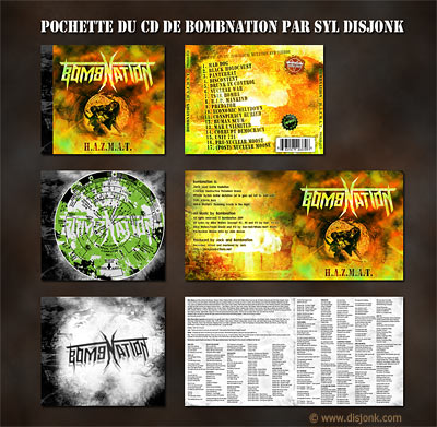
I chose to Analyse this set of image because it is a good example of going over the top in your designs. This design looks like it could be for a dance, Drum and Bass or Jungle music target audience. The attention to detail is considerably less that the hazey janes suggestion that these target audiences are not interested in the story behind the music but just the music its self. My point that I make about the hazey janes CD design being simplistic yet effective still plays its roll as when I look at the CD design from this album I think nothing much of it and think there is too much going on and you wont see it much anyway. On the other side of the argument it obviously appeals to the target audience of the album and so therefore its justifiable

The Hazey Janes' album covers are a good example of what I would be interested in creating. Instead of using real photos or portraits, They have used draw Illustrations instead. I think this opens up the creative possibilities and therefore can make the album cover works of art and deliver maximum visual interest. I also like the way in which Each of their covers have a consistent theme in the terms of colour, fonts and visual ideas. I notice straight away the simple idea of having the disc in one colour. Many other disc designs can be way over the top and although this might be nice to look at, you're not going to see the CD much if you use it. I also like the crumpled, cardboard look of the bottom design, which is subtle yet completes the look and the people looking at this digipak design might not notice this at first but i plays a big subconscious part of the overall design.
There is scope for more detail in this blog. How do these designs reflect their genres, how do they appeal to their target audience? etc
ReplyDelete